At first, I assumed it was just another Android app copying Apple’s Dynamic Island. But after using it for a while, I realized it makes notifications easier to glance at and manage without constantly interrupting whatever I’m doing on my phone.
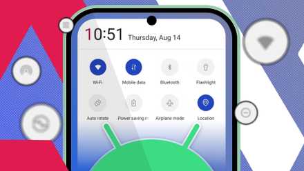
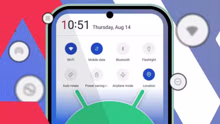
I created a personal command center with Android’s Quick Settings tiles
And now I barely open apps
It brings everything to one place without getting in the way


One thing I immediately liked about dynamicSpot is that it centralizes the information.
Instead of constantly switching between the notification shade, lock screen, media player, and status bar icons, the app keeps ongoing activities in a compact space near the camera cutout. Music playback, timers, charging status, incoming notifications, navigation activity, and battery information become easier to glance at without interrupting whatever I’m doing.
Traditional Android notifications often take over the top portion of the screen and disappear quickly. Meanwhile, the notification shade requires an extra swipe every time I want to check something. With dynamicSpot, the information stays visible enough to notice, but it doesn’t constantly pull my attention away from apps, videos, or scrolling.
I also like that interacting with notifications feels faster. I can expand the floating pop-up for more controls, reply to messages, pause music, or check progress without fully leaving the app I’m currently using.
After a while, I realized I was pulling down the notification shade far less often because most of the information I actually needed was already visible at the top of the screen.
Music controls are where the app really shines


The feature I ended up using most in dynamicSpot is the music integration.
On Android, media controls are usually inside the notification shade, which means I constantly have to swipe down to pause a song, skip a track, or check what’s playing.
dynamicSpot makes music controls feel much more accessible.
Whenever I start playing music or a podcast, the app keeps playback information visible near the camera cutout without taking over the entire screen. I can pause tracks, skip songs, or return to the app from the floating window.
The controls stay available when I need them, but they don’t dominate the notification panel or interrupt whatever I’m doing. It almost feels like Android should already handle media controls this way by default.
It handles background activities better than standard Android notifications
Another thing dynamicSpot does well is handling ongoing background activities that typically stay buried inside Android’s notification shade.
Timers, charging progress, battery status, navigation activity, and calls stay visible in a much cleaner way. Instead of disappearing into a stack of notifications, they remain accessible through the floating pop-up at the top of the screen.
I noticed this most with timers and charging information. Normally, I would have to swipe down the notification shade repeatedly to check the remaining timer duration.
Navigation apps also feel less intrusive this way. Instead of large notifications constantly taking over the screen, directions and activity updates stay compact while still being easily accessible when needed.
The customization is surprisingly useful


I can adjust the pop-up size, position, animations, colors, app behavior, and interaction settings depending on how I want notifications to appear. There are also options for controlling which apps can use dynamicSpot, how long pop-ups stay visible, and whether notifications expand automatically.
For example, I can make the window smaller or change the position of the cutout so it feels less distracting while watching videos. The app offers the option to change interaction behavior to make music controls easier to access one-handed. I can also filter certain apps entirely, so the floating window only appears for some notifications.
6 Android tweaks I made to cut clutter from my phone
A quick cleanup helped me use my phone more mindfully
dynamicSpot made Android notifications feel less frustrating
After using dynamicSpot for weeks, I realized the app isn’t really about copying Apple’s Dynamic Island. It’s more about making notifications feel easier to manage.
Music controls, timers, charging information, and ongoing activities all stay accessible without constantly forcing me into the notification shade. At the same time, the floating pill feels subtle enough that it doesn’t interrupt whatever I’m doing on my phone.
The app also solves a very practical problem. Notifications can often feel either too intrusive or too easy to miss, especially once dozens of alerts start competing for space throughout the day. dynamicSpot finds a much better balance between visibility and distraction.